Noen nyttige ting for deg
Vi har valgt ut noen interessante ting som kan være av interesse for deg
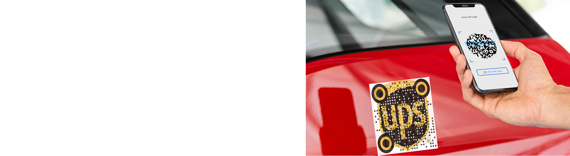
Creative Ways to Color and Style Augmented Reality QR Codes
To create a QR code for a link, video or picture - click on the button below.
Article Plan
- Why Styling Matters for AR QR Codes
- Color Combination Best Practices
- Styling Techniques Table
- Design Approaches by Industry
- Logo Integration Rules
- Color Psychology for AR QR Codes
- Advanced Styling Without Compromising Scans
- Testing Styled QR Codes
-
Frequently Asked Questions about Ways to Color and Style Augmented Reality QR Codes
- Can I use multiple colors in the QR code pattern?
- What contrast ratio should I maintain?
- Can I rotate or tilt a QR code in design?
- How do I know if my styled code is scannable?
- Should I use gradient backgrounds for QR codes?
- Can I add text near styled QR codes?
- What error correction level for minimal styling?
Why Styling Matters for AR QR Codes
Generic black-and-white QR codes lack brand personality. Styled QR codes increase engagement, build trust, and encourage scans—but poor execution destroys scannability. The challenge: maintain visual appeal while preserving functionality. Understanding contrast ratios, error correction, and device limitations separates successful branded codes from failed experiments.
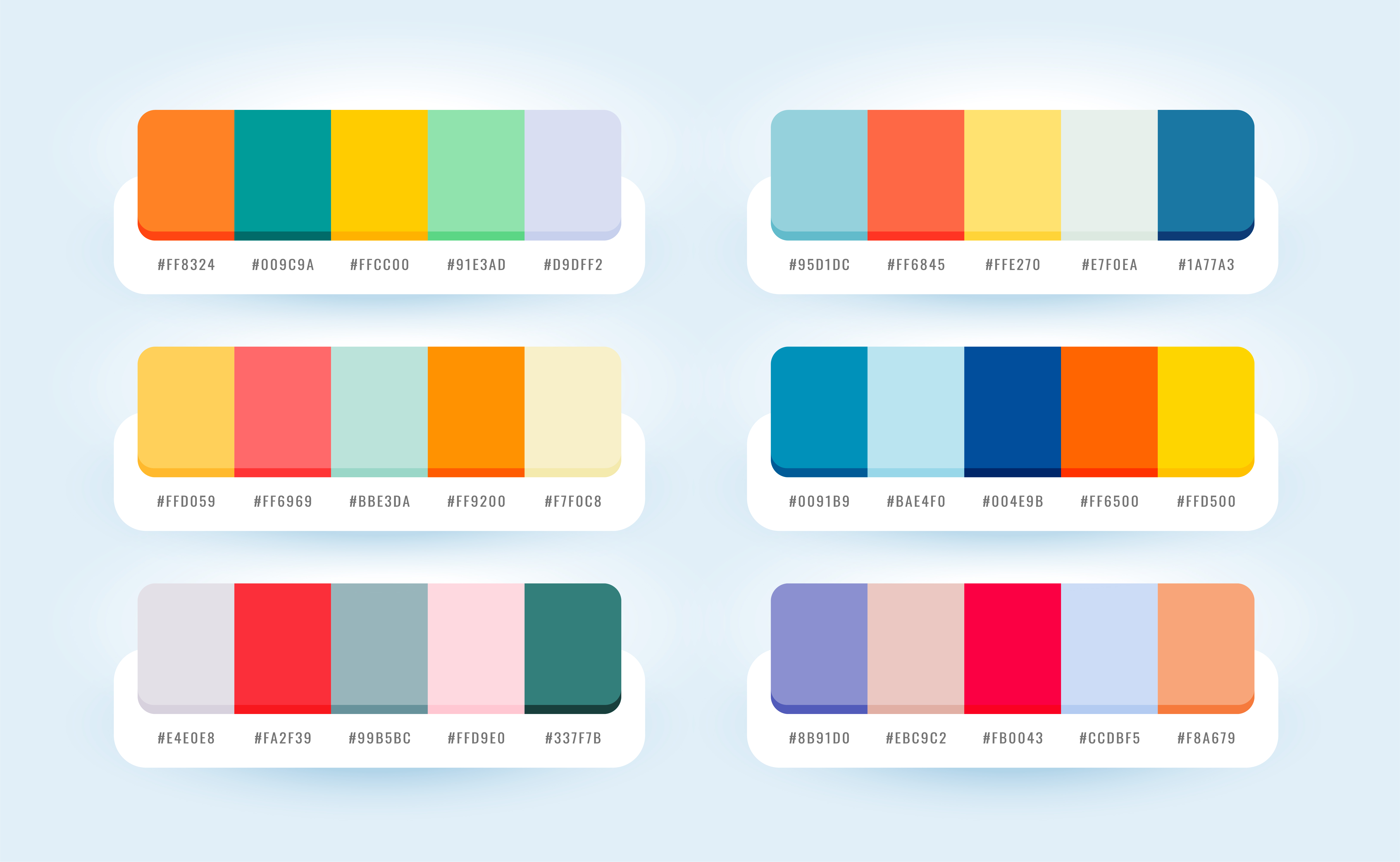
Color Combination Best Practices
High-Contrast Winners:
- Dark navy on white
- Black on cream
- Dark teal on light gray
- Dark purple on pale yellow
- Dark green on off-white
Minimum Requirement: 3:1 contrast ratio. Test on multiple screens before deployment—screen brightness affects perceived contrast.
Critical Rule: Dark foreground on light background always. Inverted designs (light on dark) fail on most smartphone cameras.
Styling Techniques Table
| Technique | Pros | Cons | Error Level Needed | Logo Size Limit |
|
Solid Color Codes
|
Simple, reliable, strong contrast |
Generic appearance
|
L or M
|
None needed
|
|
Gradient Frames
|
Brand integration, visual appeal
|
Adds complexity if overdone
|
M or Q
|
N/A (frame only)
|
|
Corner Branding |
Subtle customization, minimal interference
|
Limited design space
|
M
|
N/A
|
|
Center Logos
|
Clear brand presence, professional
|
Risk of scan failure if oversized
|
Q or H
|
Max 30%
|
|
Border Frames with CTA
|
Educates users, increases scans
|
Requires proper quiet zone management
|
M or Q
|
N/A
|
|
Patterned Modules
|
Unique aesthetic, artistic
|
Significantly reduces reliability
|
H only
|
Use sparingly
|
Design Approaches by Industry
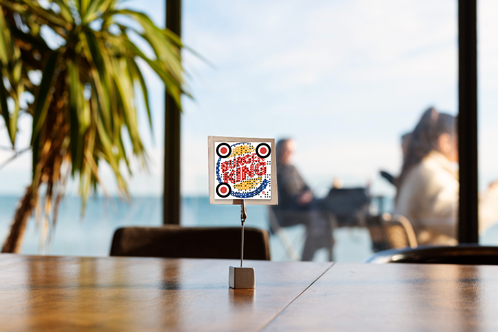
Retail & E-commerce: Simple dark codes on product packaging with subtle brand colors in frame. Minimal logo integration. Error level Q.
Events & Activations: Vibrant colors matching event branding; frames with event name/date. Center logo acceptable with H-level correction.
Tech/Startups: Monochrome with brand accent color in corners. Minimalist frames. Logos in clean geometric shapes.
Hospitality: Elegant gradients in frame only (never in code itself). Sophisticated color palettes. Professional logo placement.
Manufacturing: High contrast (black/white). Minimal styling. Readability prioritized over aesthetics.

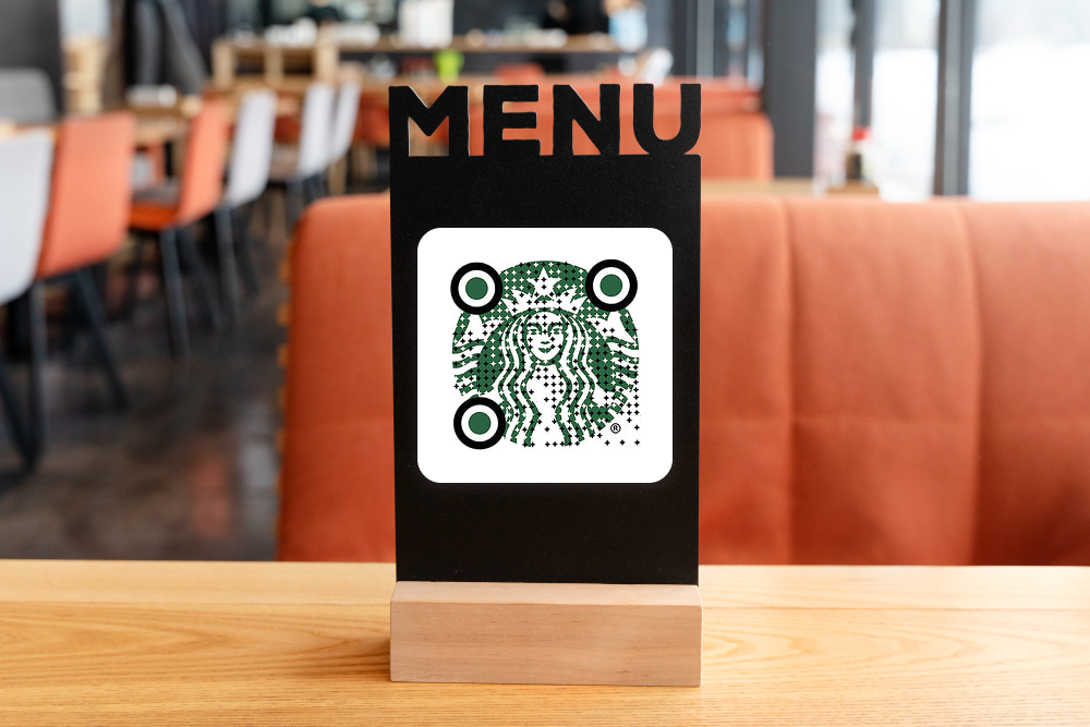
Logo Integration Rules
Center Placement Only: Position logos dead center. Any offset risks scanning failure.
Size Limits:
- Q-level correction: ≤15% coverage
- H-level correction: ≤30% coverage
- Never exceed these limits regardless of error level
Background: Solid white or light background behind logo. Never place logo directly on code modules.
Shape: Circular or square logos work best. Avoid intricate details; simple, recognizable shapes scan reliably.
Color Psychology for AR QR Codes
Blue: Trust, technology, reliability—effective for finance, tech, professional services.
Green: Growth, sustainability, health—ideal for eco-friendly, wellness, agricultural brands.
Red: Urgency, energy, action—works for time-sensitive campaigns, promotions, entertainment.
Purple: Creativity, luxury, premium—suits beauty, fashion, premium experiences.
Orange: Friendly, approachable, energetic—effective for retail, hospitality, consumer goods.
Gray/Neutral: Professional, trustworthy—safe choice for B2B, corporate, conservative brands.

Advanced Styling Without Compromising Scans
Rounded Corners: Slightly rounded module corners add elegance. Reduce radius by 20% to maintain scannability.
Gradient Frames (Not Code): Apply gradients only to quiet zone frames, never to the code itself. Keeps design modern without reducing contrast.
Split-Color Backgrounds: Use two colors in frame (50/50 split) matching brand palette. Keeps code area clean and high-contrast.
Stylized Corner Patterns: Replace standard corner squares with brand-aligned designs while maintaining white/dark contrast. Requires H-level correction.
Animated Overlays (Digital Only): For digital displays, add subtle animations around codes (pulsing frames, breathing effects). Never animate the code itself.
Testing Styled QR Codes
Before Deployment:
- Scan on minimum 5 phone models (iOS older/newer, Android models)
- Test from minimum and maximum intended distances
- Verify in poor lighting (dim rooms, outdoors in sun)
- Test at 45-degree angles
- Have non-technical users test
Success Criteria: 95%+ scan success rate across all devices and conditions.
Failure Response: If any test fails, increase error correction level (L→M→Q→H) or simplify design (remove logo, adjust colors).

Frequently Asked Questions about Ways to Color and Style Augmented Reality QR Codes
Minimum 3:1. Higher is better (5:1+ is ideal). Test on multiple screens—brightness affects perceived contrast significantly.
Minor rotations (5–10 degrees) work with H-level correction. Major rotations cause scanning failures. Keep codes straight and upright when possible.
Test extensively. If it fails on any device/distance/lighting combination, increase error correction or simplify design. When in doubt, remove styling elements.
Q-level (25% tolerance) handles most branded designs. Use H-level (30% tolerance) for complex logos or multiple color elements.